The reward for good work is more work 😃
Jaggu Uncle is back. He was very happy with your work on the inventory management worksheet you setup for Jugaad Hardware and have some more requirements. Last time (Q1-P2) you helped him get his stock under control. This time they are digitizing their sales tracking and analytics.
The Worksheet
Jugaad Hardware has handed you six months of sales records (October 2025 – March 2026), which you can download by clicking here. It contains the following sheets:
Item_Master: Same as the last problem set (P2), contains a list of their products.Sales: Contains all the sales. Each row is one sale.Sales_Analytics: Will contain the analytics you will carry out based on the requirements.Charts: Blank for now, will have the colourful charts you will add.
Sales Analytics
Use your lookup and SUMIFS skills to fill the following columns in the Sales_Analytics sheet:
- Item Name, Category, Selling Price: simple lookup
- Units sold: total number of units sold for this item
- Revenue: the total money made from the sale of this item
Charts
This task involves building some useful charts, but before that, some calculations (summary tables) need to be in place. Open up the Charts sheet, you will see three empty tables:
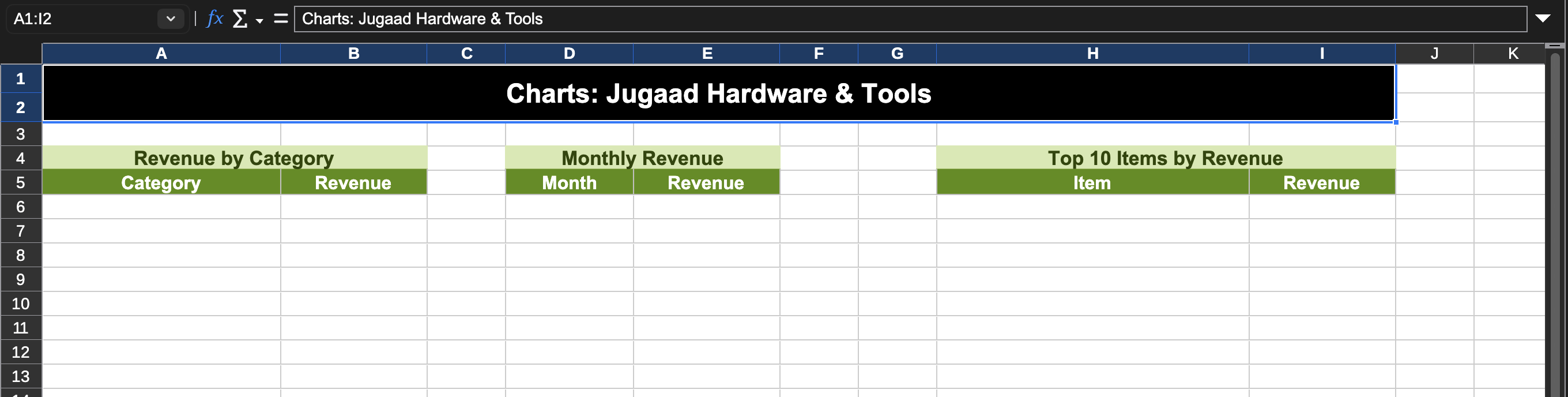
Sheet: Charts
Revenue by Category
This chart will help Jugaad Hardware to visually see the distribution of revenue coming from each of the item categories. Manually fill the 10 unique category names in column A (A6:A15), you can use the Category column in the Items list sheet to figure out the same. To find the revenue B6:B15, you will have to use SUMIFS to get the revenue for items belonging to this particular category (you have calculated the revenue column in the last section), then use auto-fill for rest of the rows.
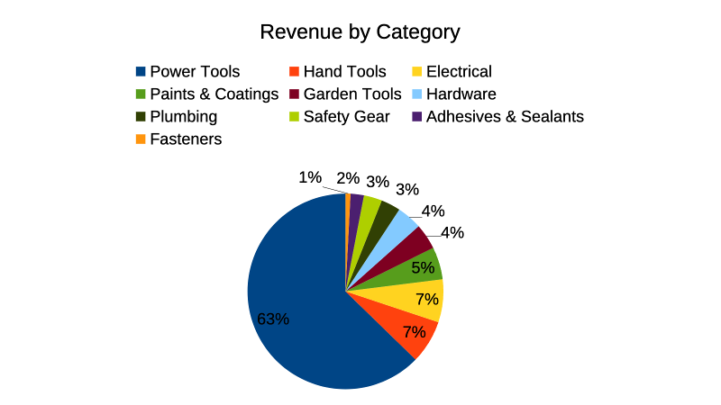
Now that we have the table, let's create a chart! Actually, two charts using this same data! First up, we have to create a Pie Chart which will show the share of revenue that each of the category brings. Add a title to the chart: "Revenue by Category" and also change the "Legend" position to Top.
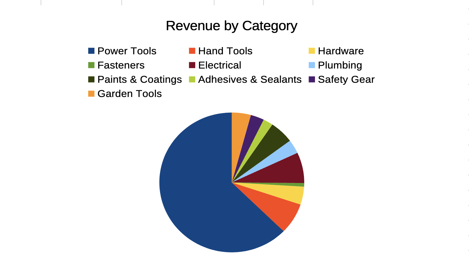
But we also need % labels, here is how you can add the same:
- Be in the Chart edit mode (if not sure, click outside the chart and then double click the chart)
- Right click on the Pie and select Insert Data Labels...
- Step 2 will enter actual revenue, to get percentage instead, right click the Pie again and select Format Data Labels...
- Go to the Data Labels menu option
- Uncheck "Value as number" and check "Value as percentage"
- Click "OK"
If you followed the steps properly, the chart should look like this:
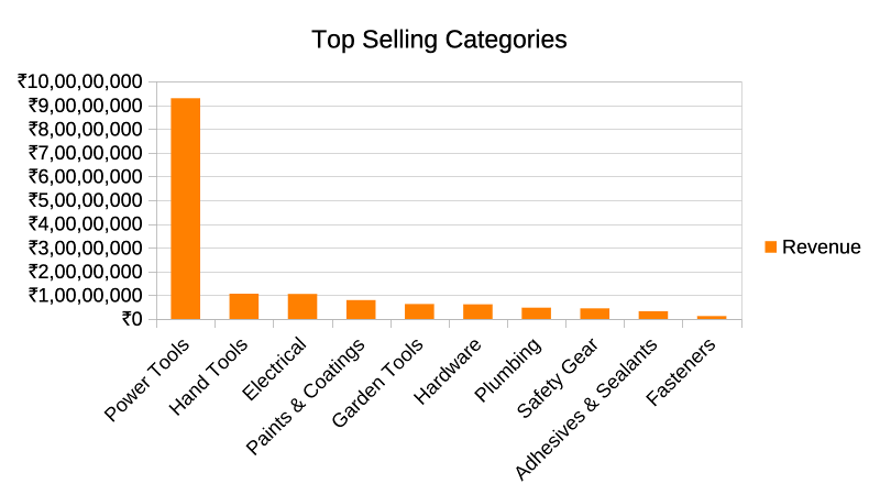
The next chart you have to create is a Column (vertical bar) chart which will display the revenue per category in descending order, i.e. it will help Jaggu Uncle to see which are the top selling categories.
Start by selecting the data and sorting (Data > Sort) it by Revenue column in descending order.
Then select the data (along with the column headers) and insert a column chart with the title Top Selling Categories. Customise the color of the bars to something else as per your liking. Here is how it should look:
Monthly Revenue
Now we want to create a chart that shows revenue over past months. Start by adding the following rows in the Month column of the Monthly Revenue table:
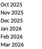
Now we need to fetch the revenue (total sales) for each of these months. But how do we do that? We have a Date column in the Sales sheet but not in the MMM, YYYY format like above, which is needed if we want to do SUMIFS of the sales. We will need to first add a new column to Sales sheet which will use the Date column to extract the Month. You can use this formula to do it:
=TEXT(B4,"MMM YYYY")
Then go back to the Charts sheet and add the revenue for the Oct 2025 row. Once that is done, you can auto-fill to the other months. Then you can use this table (data) to create a new column chart which should look like this:
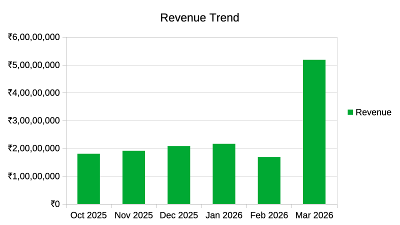
The title and bar color should match (pick any green)
LARGE function
Consider the below sample data:
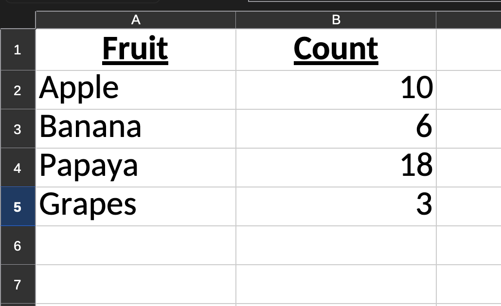
I want to get the largest (highest) value from the column B (B2:B5). For this I can use a new function named LARGE :
=LARGE(B2:B5, 1) # highest
=LARGE(B2:B5, 2) # 2nd highest
The above will give you 18 (highest) and 10 (second highest) respectively. With this information, you are ready to tackle the final chart of this assignment.
Top 10 Items by Revenue
The last chart we need to create will help Jugaad Hardware to quickly view the top 10 selling items (by revenue). Go to the Charts sheet and let's start filling in the Top 10 Items by Revenue table. Your first task is to use the LARGE function get the highest revenue of any item from the Sales Analytics sheet (in cell I6). Then I7 will contain the second highest revenue, I8 3rd highest, and so only till 10th highest. Sorry, you won't be able to use auto-fill here :)
Once you have the revenue column filled in, you can lookup the item name (Column H) based on the Revenue. Now it is just a matter of adding a Bar Chart. Select the data (10 rows + header row) and insert a bar chart. Set the title to "Top 10 Items by Revenue". Here is how the chart will look like:
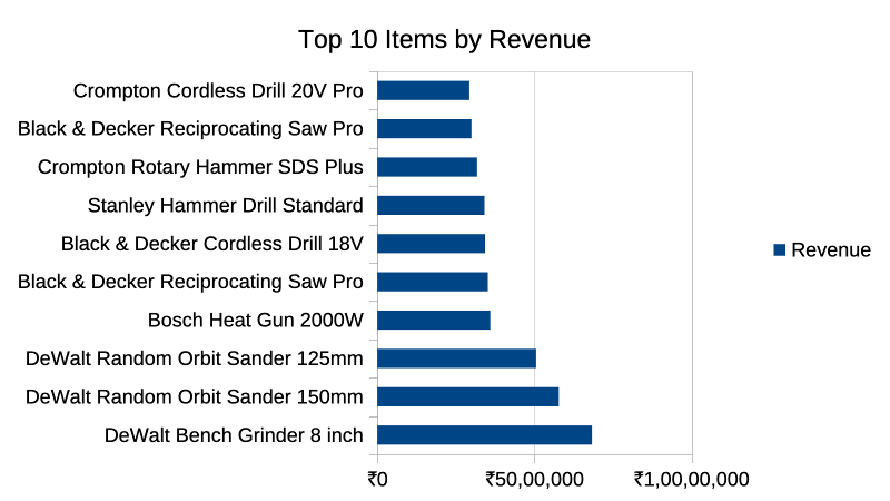
But there is a problem here, it is in reverse order of what we want, because Calc will plot the last row first. To fix this, just sort the items in ascending order of Revenue instead, which should fix the chart.
Slides
Jugaad Hardware has asked you to create a presentation for their different products using LibreOffice Impress. The presentation will be based on the item categories and items you found on the Item_Master sheet.
Here are the mandatory requirements for the slideshow:
- It should have at least 15 slides
- It should have relevant images and icons
- Use proper alignment and layout
- Proper logos if using company
Feel free to use your own creativity on top of this and also images. You can use websites like https://unsplash.com/ to download high quality images for your slideshow.
Submission
Save your spreadsheet file as sales_analytics_by_<name> and your slideshow as presentation_by_<name> where name is your first name. Compress both the files to ZIP and then submit the assignment via this link.